
Friday 20 March 2015
Question2:
Geeky character wore glasses and a shirt where as the popular girl wore make-up and was always on her phone. We exaggerated the fact she was always on her phone, its the reason she bumped into the geeky boy.
Question4:


This a Facebook profile of someone who i feel would watch strange connection.It shows movies which she watches and likes
Question5:
This a video of a member of my target audience.
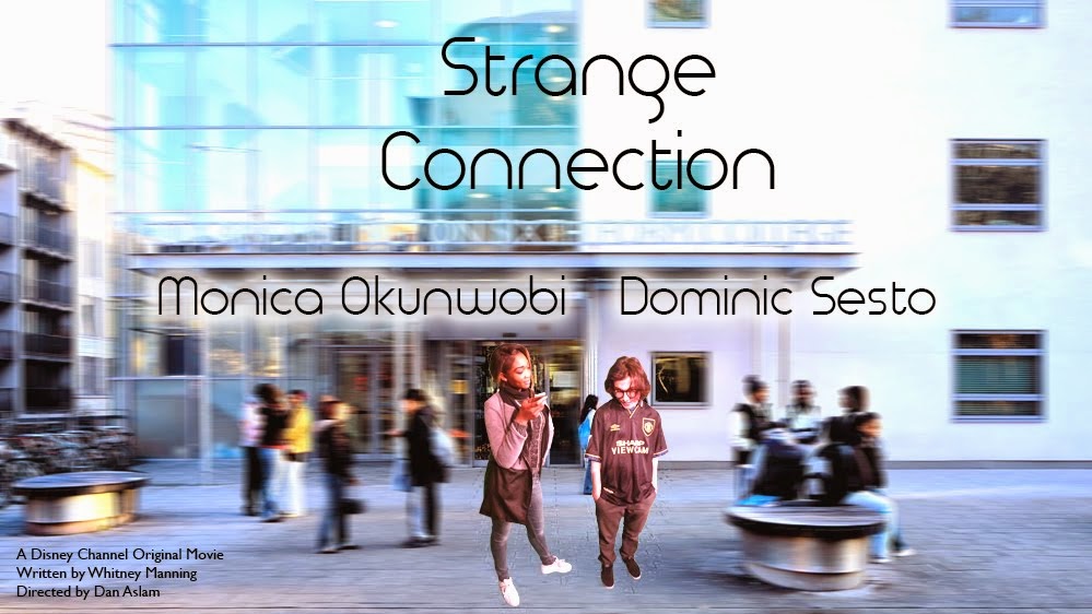
What i think appeals to my target audience is the style and look of my title sequence as it has this elegant but fun a simple look to it which mid-late teens enjoy. Also the fact that its set in a school environment so they can relate. The actors don't look to glammed up however they do match there role perfectly. Teens love to believe they can be movie stars so making the actors look like normal people the audience feel at one with the actors. Also the actors were not experienced so the film could get a real kind of feel. The story line allows the teens to understand that its kay to like someone thats is outside your social group or comfort zone. The film name was short and catchy (STRANGE CONNECT) its quite secretive and doesn't give anything away which is a good contrast considering we had a narrative type of title sequence. Disney always distributes movies like this so it was only right we used the company for distribution and production.
The rough cut was extremely useful in terms of getting feedback it allowed us to change the music up a little because people said it was to repetitive which made the film sequence seem long and boring. so we changed it to keep our audiences attention.
There was a cinema preview aimed at students we used youtube, Vimeo and DVD in terms of where it was distributed.
We definitely aimed our movie at a wider audience such as 18 plus. These were for the people who are still into these movie or want to bring back childhood memories of movies in there day also mothers who bring their children to watch but also enjoy the movie too.
Wednesday 11 March 2015
Coursework Evaluation Q3
WHAT KIND OF MEDIA INSTITUTION MIGHT DISTRIBUTE YOUR MEDIA PRODUCT & WHY?
PRODUCTION & DISTRIBUTION COMPANY?
One we used was disney channel as this is a channel for teens and young children and that is what "STRANGE CONNECTION" is aimed at.
Disney Media Distribution (DMD) is responsible for The Walt Disney Company's branded and non-branded filmed entertainment distribution, now distributing more than 30,000 hours of content to over 1300 broadcasters across 240 territories worldwide.
PRODUCTION & DISTRIBUTION COMPANY?
One we used was disney channel as this is a channel for teens and young children and that is what "STRANGE CONNECTION" is aimed at.
Disney channel is a big major company
Disney Media Distribution (DMD) is responsible for The Walt Disney Company's branded and non-branded filmed entertainment distribution, now distributing more than 30,000 hours of content to over 1300 broadcasters across 240 territories worldwide.
EVALUATION QUESTION 2
From this i can conclude that the characters we made have stereotypical attributes worked and was successful as it is clearly portrayed in the film. By using mise en scene especially as well as sound effects 'clicking of text' we showed the two types of characters clearly enough for the audience to distinguish who is 'a geek' or 'popular'
EVALUATION QUESTION 5
Overall our film attracted the correct target audience as Abdul says he expects it to appeal to young teenagers, our target audience was young teenagers, on that point our film was successful.
The rough cut feedback certainly helped us as a group make major changes, without it we would have broken the 180 degree rule and we were constantly changing scenes and moving things around.
Also the rough cut let us work from a basic frame of the film and know whats going on at all times.
So far we have reached our audience on only a couple of platforms : Vimeo, and a cinema screening.
We hope our film attracts to a wider audience as well as young teenagers, to find out if it will i will ask the older people who watched it and see what they thought.
Coursework Evaluation Q5

What Went Well:
- The camera shots used worked well.
- The idea for the film is good and fits in with other Disney Films.
- Interweaving the shots of the two characters works well (cross cuts).
- The beginning, before the characters enter could be slightly shorter.
- There should be more of an introduction of the characters rather than just having them walking up and down stairs.
- The music is too repetitive and needs to feel more like a Disney film, try some other ideas for sound?
- It feels like, for an opening, it's too elongated and doesn't necessarily capture the audience's attention the way it should. This could be as a result of the repetitive music or maybe even the walking scenes lasting too long.


Coursework Evaluation Q7
LOOKING BACK AT THE PREMILINARY TASK, WHAT DO YOU FEEL YOU HAVE LEARNT IN THE PROGRESSION FROM IT TO THE FULL PRODUCT?
Monday 9 March 2015
Sunday 8 March 2015
Analysis of title sequence - Cosmo
Big Block Design Group take us on the grandest journey imaginable with their beautifully designed opening sequence for Cosmos: A Spacetime Odyssey, the sequel to Carl Sagan’s landmark 1980 documentary series.
With the incredible advances in science and technology over the last 34 years, the “ship of the imagination” (this time piloted by astrophysicist Neil deGrasse Tyson) can now travel through time and space. From the microscopic building blocks of life all the way to a distant galaxy in the furthest reaches of outer space, this fantastic main title journey is only made possible thanks to seamless VFX transitions so perfect that they rival the best Hollywood films.


Favourite film analysis😊
I love the way GBF is funny, interesting and energetic, the poster says it all, it puts it all in one prospective of how the movie is set up.
I always have an eye for colourful adverts because they are eye-catchy , makes it look like it will be a really good film to watch.
It is my fav film because it's very modern and a different type of teen drama, it's not as typical.

In this photo: she is questioning herself about how her body is set up and if it looks good or not.
In this photo: she's talking about how she wants a GBF and she knows he's going to come out anytime soon. 


How to keep up to date with group work😊😊😊
We have a whatsapp groupchat that helps my group communicate with eachother & brings our ideas together.

Blogging Health Check
I had a blogging health check with Marissa and was told I needed to make changes to my blog on 'categorising title sequences' as the previous one I did was picture i took of written work , that i imbedded in to the blog and ended upside down. she said it didn't look professional and was extremely hard too read. so i changed it into a table format using ICT.
Marissa also said that I need to blog more
Marissa also said that I need to blog more
Thursday 5 March 2015
reflection of filming : production
We came across a few faults when we started filming, we had feedback being told that the camera was shaky which means we didn't film and review properly and also our mise en scene and costumes were not as good and well thought of
which meant we had to re film in such little time.
we thought we wouldn't have enough time but in the end we done it.
we are proud of the different camera angles we put together.
which meant we had to re film in such little time.
we thought we wouldn't have enough time but in the end we done it.
we are proud of the different camera angles we put together.
Pitch Tasks
We all had different tasks to do when doing the pitch,
we all had an order in the things we were going to do.
I started of with the introduction then we performed well so on, I think that we could of improved by being more live and bubbly.
I started of with the introduction then we performed well so on, I think that we could of improved by being more live and bubbly.
PICKING FONTS
As a group we had to explore the different fonts so that it would match the genre of the film type.
for example
we cannot have scary type of font for a romantic
we had to make sure we thought about what matched
we didn't want to make any mistakes
research
-youtube
-web
-images
-fontfun
we also looked at other films that had the same genre as us.
We chose to go for a font that had style and represented the title and meaning of the short film.
research
-youtube
-web
-images
-fontfun
we also looked at other films that had the same genre as us.
We chose to go for a font that had style and represented the title and meaning of the short film.
Wednesday 4 March 2015
Favourite Film analysis
The Hunger Games
The type of title sequence this film uses is Titles over Moving Images.
They incorporate alot of moving images in this title sequence. The credits are less dominant and the animations seem to be more important. As I've watched the movie i know that the mocking jay is a very important feature in the film. They use black, white and grey scale for the moving images and the type face is black.
This title sequence creates suspense, tension whilst adding a fast tone to the overall film. Which links to the film.
Categorising Title Sequences


1. Narrative title sequences
The titles are integrated into the moving images in some way and begins as the film itself begins. It goes straight into the plot. Inter cut, top of the screen. This might be as a long establishing shot. Getting the audience straight into the film.2. Discrete title sequences
The titles are integrated into the moving images but it is not entirely clear about what the films plot/story line is about. this kind of title sequence helps to set the tone and gives what could happen later in the film. This type of title sequence is common when the film doesn't want to give anything away.
3.Stylized title sequences
The title sequence are integrated with filters, animations and visual effects. The can be a mixture of the other 2 sub categories in terms of what we see. However the moving images and the credits have been stylised (using filter , motion etc) to create a combined effect.
My preference out of the 3 is narrative because i prefer to not about what I'm about to see.
Making a website

Making the website i had to look at other film websites for inspiration and things to avoid, I noticed it was almost essential to have your film cover / poster involved in the home page. The image above isn't a high school film yet has a very clean look and is clear to navigate around.
For our own i will involve the poster on the home page then the option to watch the opening on the second page.
Tuesday 3 March 2015
Production: Feedback
While our opening sequence has improved a great deal, we still face the issue whereby the music doesn't build up as well as it maybe should.
Another thought that our titles went on for too long, they were 5 seconds long, we will now shorten them to two seconds.
Furthermore, we were told the font was too boring and that we needed something more stylised. I made a point that the Disney Channel movies that we are modelling our sequences from have very plain fonts. We may, as a result of this, challenge Disney's ideas though we may just conform.
In terms of the film itself, we were told there were no extreme issues and that it is a well filmed and edited video.
Monday 2 March 2015

garange band ; late upload
>
We can then layer them and also add other sound track from external sources using the timeline.


We can layer different sounds - such as those from apple loops.

Feedback from Marisa on final piece
After Marisa watched our clip :
One thing she commented on was that the intro clips were too long, so we clipped the shots down from 5 seconds to 3 seconds.
Another comment she added was that the music was too constant as the scenes were building up tension the music should match , we will work on the music to match the tension of the scenes.
One more thing she commented on was the font in out opening, she said it as too plain and boring which i agree with so we looked for a slightly more stylised look for the font.
Subscribe to:
Posts (Atom)